Write a short report the file can support. Separate process from the scoreline. Name what event data cannot prove.
Skills you will practice
Sample lesson titles
How to write a proper analytical report
10 min
When you write a report, keep three things apart. First: what the file shows. Second: what that might mean. Third: what you would try in the next session.
A supportable report keeps three voices separate: observation, inference, and recommendation.
How to read this: Observation states what the file shows. Inference states what it might mean. Recommendation states what to try next. Mixing them overstates certainty.
Only put two numbers side by side if they talk about the same thing. If they do not match, write the mismatch. Do not hide it. Example: a team had more of the ball but built few good chances. High possession, low xG. Say that. Do not invent a story to cover the gap. Another example: a team pressed a lot (a low PPDA) but still conceded many shots. That does not fit either. Name it.
End with one defensive job and one attacking job. If a number would not change any training session, leave it out. A blocked cross can still be useful. No shot is not the same as no attack. Keep penalty shoot-outs out of the open-play totals.
Common interpretation mistakes
10 min
The usual misread is to treat the scoreline as proof of the process, or a process number as proof of the scoreline. Event data cannot carry that load.
One scoreline is not proof of the process, and one process number is not proof of the scoreline.
How to read this: A single highlighted match can sit anywhere in a wider spread. Name the sample size before treating one point as the pattern.
Average Positions do not prove a formation. Progressive Pass volume does not prove dominance. PPDA is not morality. xG alone does not settle the match story. A Pass Network shows correlation, not causation.
Use one discipline habit. For every claim, name the evidence type. Is it event data, tracking, video, or qualitative context? Then name what would falsify the claim. That habit beats any single chart.
Connecting metrics into one story
8 min
Connect two numbers only when they answer the same question. If they disagree, write the disagreement. Do not force a single plot.
Connect two numbers only when they answer the same question — if they disagree, write the disagreement.
How to read this: Progressive passes, a shot cluster, and a PPDA shift can converge on one timed question. Forcing metrics that answer different questions into one story is decoration, not evidence.
The file can support linking progressive-pass volume, a shot-map cluster, and a PPDA shift when they answer one timed-overload question. High possession with tiny xG, or low PPDA with many shots against, is tension to name — not a story to force.
It cannot prove the trigger for that overload or the coordination that video would show. End with one defensive priority and one attacking priority. Data that changes no meeting or training behaviour is decoration.
Event data records what happened on the ball. It does not show where every player stood.
How to read this: Left: the scattered event points. Right: a dashed line standing in for tracking, which these files do not contain. Do not draw that path from guesswork.
xG estimates how good a shot was. It does not decide who won.
How to read this: Ten equal circles are ten similar shots at about 0.30. In the historical sample, roughly three of those ten are goals. In one match that three may arrive, or not.
Equal dots show location only. Chance quality needs an xG (or similar) encoding.
How to read this: Left: three equal markers. Right: the same locations sized by quality. A distant shot is no longer equal to a tap-in.
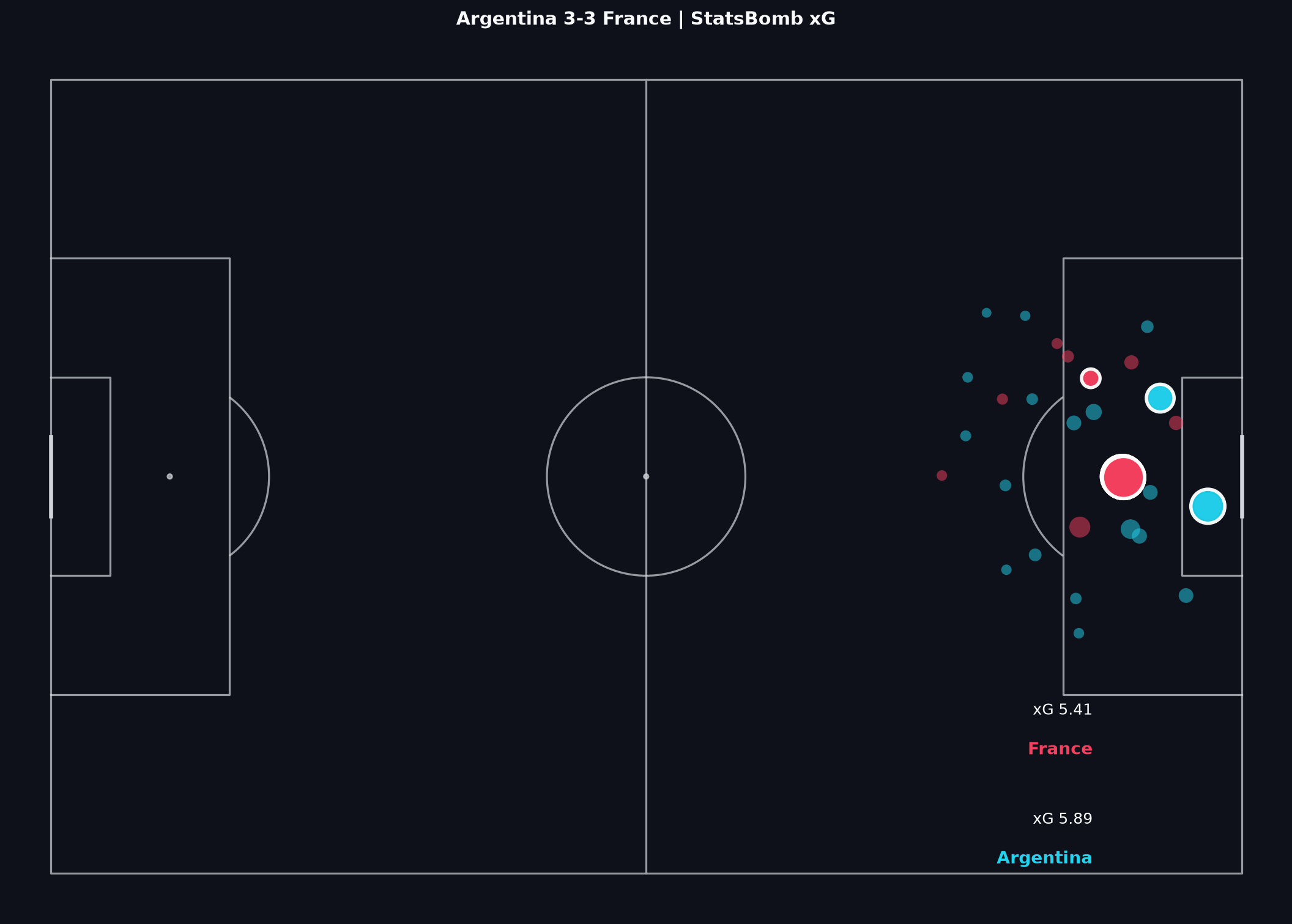
From Match Analysis: Argentina–France shot map
Match Lab Shot Maps encode more than location. Read volume with quality and phase.
How to read this: This is the Argentina–France teaching Shot Map from Match Analysis. Count dots only after you know how markers encode quality and phase.
A pass network is a graph of players and completed-pass links — not a tracking picture of off-ball positioning.
How to read this: Thicker edges mean more frequent completed links between two average locations. Thin edges can mean isolation, a small sample, or a score-state shift.
A progressive pass is a completed pass that gains stated ground toward the opponent goal. Volume and share are different questions.
How to read this: Normalise attack direction first. This layer is not the Transition board and not a tracking carry map.
PPDA is a press-intensity proxy. It is not a fitness ranking and not a quality score for the press.
How to read this: A lower rate means more defensive actions relative to opponent passes in the named zone. Compactness, distance run, and coordination still need video.
A heatmap counts on-ball events in pitch cells. It is not a tracking picture of off-ball standing, and not a proof of formation.
How to read this: Hotter zones mean more recorded on-ball actions there. Average position is one summary point of those actions — not continuous location without the ball.
A supportable report keeps three voices separate: observation, inference, and recommendation.
How to read this: Observation states what the file shows. Inference states what it might mean. Recommendation states what to try next. Mixing them overstates certainty.
One scoreline is not proof of the process, and one process number is not proof of the scoreline.
How to read this: A single highlighted match can sit anywhere in a wider spread. Name the sample size before treating one point as the pattern.
Connect two numbers only when they answer the same question — if they disagree, write the disagreement.
How to read this: Progressive passes, a shot cluster, and a PPDA shift can converge on one timed question. Forcing metrics that answer different questions into one story is decoration, not evidence.
A capstone brief separates the pre-match question from the post-match supported sentences — the scoreline is not the report.
How to read this: Layer shot quality, progressive patterns, a pressing proxy, and spatial summaries, each with a named definition, then keep observation, inference, and recommendation apart.
Quality means every claim names its sample and its limit — a higher bar is more supported sentences, not a harsher verdict.
How to read this: Move from an unsupported claim toward a claim that names its sample size and states its limit. That shift is what raises the bar, not stronger language.
xG starts once a shot exists — possession value asks about the threatening buildup before the attempt.
How to read this: The left dot is a single shot's xG. The right chain is value added across the possession that led there, even when it never produces a shot.
xT estimates threat from location and action — not a finish model and not a verdict on the result.
How to read this: Zones closer to goal carry higher scoring likelihood historically. A pass into a brighter zone can raise xT; a backward pass can lose it.
Shot value asks how good the finish chance was; action value asks whether an earlier choice moved the ball into a more dangerous state.
How to read this: A blocked cross can carry action value with zero shot value. Treat 'no shot' as not the same as 'no process.'
A possession-value lead is not a moral win — single-match sums are noisy, and conversion still happens at the shot.
How to read this: Value can climb through several progressive actions and still end without a shot. Quote both the value trend and the shot outcome; do not let one replace the other.
A recovery starts a new possession after the opponent had the ball — this layer is the Transitions Board, not a fitness ranking.
How to read this: Name the possession change, a time window, and whether the next action progressed or shot. A short post-recovery window is a conservative stand-in, not a full transition model.
Stable possession keeps the ball without immediate pressure; fragile possession ends quickly — possession share alone is not a quality verdict.
How to read this: Proxy stability with sequence volume, progression, and what follows losses, under a named definition, not by possession percentage alone.
A half table splits the same process by time — event data has no distance run, so this is not a fatigue measurement.
How to read this: Compare shots, xG, and progression half by half. Score state and substitutions can move the split as much as fitness would.
Score state is an allowed hypothesis, not proof of fatigue or coach intent — read state changes with the process, not instead of it.
How to read this: A lead, a chase, or a red card can move the metrics the file records. Name the state window and pair it with the process, rather than folding a late chase into a season identity.