
Match Analysis / FIFA World Cup 2022
Final · December 18, 2022
Argentina 3–3 France
After extra time · Argentina won on penalties
New here? This page uses terms like xG, PPDA, and progressive passes. The free Foundations lesson explains them in a few minutes. Continue on the Learn path →
Lusail Stadium · StatsBomb Open Data
Why this match is useful for learning
- Argentina finished 3–3 with France after extra time and won the shoot-out. Combined xG (open play and set pieces together) in regulation and extra time favours Argentina (~2.76 vs ~2.27) from more shots (~20 vs ~10). Progressive-pass share is wider (~23% vs ~13%). When a team wins the ball, sometimes it progresses or shoots within ten seconds — that share is the positive transition rate. Argentina’s rate is higher (~47% vs ~38%). Negative transition rate is the share of turnovers after which the opponent progressed or shot within ten seconds: after France lose the ball the window is more costly (~32% vs ~21%). France’s shot process arrives late around 80′. The penalty shoot-out is stored as a separate slice in this file. Do not add those shot values to the open-play and extra-time xG. A famous scoreline is not a verdict on the result.
Match context
Argentina led 2–0. France levelled late in normal time. Both sides scored again in extra time, and Argentina won the shoot-out.
The penalty shoot-out is stored as a separate slice in this file. Do not add those shot values to the open-play and extra-time xG. The late France equaliser and the shoot-out are separate teaching points from the earlier shot process.
Regulation and extra time (shoot-out excluded)
Figures below cover regulation and extra time. The penalty shoot-out is stored as a separate slice in this file. Do not add those shot values to the open-play and extra-time xG. Transition rates use the 10-second window after a StatsBomb possession change.
- Argentina
- 20 shots · 3 goals · ~2.76 xG
- Progressive passes: 130 (23.2% of passes)
- France
- 10 shots · 3 goals · ~2.27 xG
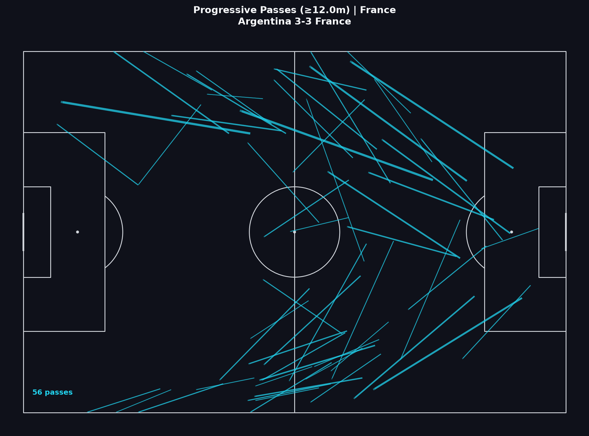
- Progressive passes: 56 (12.9% of passes)
Visual 1
xG Timeline
Argentina finish ahead on combined xG (open play and set pieces together) in regulation and extra time (~2.76 to ~2.27). The line rises with the first-half goals. France’s line stays almost flat until a late cluster around 80′. Extra time trades goals. This chart is not a verdict on the result.
The line adds xG when a shot is recorded. A flat stretch means no shot, not that nothing happened. This is not xT and not a possession-value chart. The line is not a verdict on the result.
- 22′ · Argentina · Lionel Andrés Messi Cuccittini · 0.78 xG
- 35′ · Argentina · Ángel Fabián Di María Hernández · 0.30 xG
- 79′ · France · Kylian Mbappé Lottin · 0.78 xG
- 80′ · France · Kylian Mbappé Lottin · 0.10 xG
- 107′ · Argentina · Lionel Andrés Messi Cuccittini · 0.49 xG
- 117′ · France · Kylian Mbappé Lottin · 0.78 xG
How to read this
- Mark Argentina’s early climb against France’s late cluster around 80′. Only a recorded shot moves this line.
- Extra time adds another exchange. Process and scoreline diverge more than once — that is the lesson.
- The penalty shoot-out is stored as a separate slice in this file. Do not add those shot values to the open-play and extra-time xG.
Limitations
- xG describes historical shot types. It does not measure build-up quality before the shot.
- A goal marker shows when the ball entered the net, not whether that chance was high xG.
- Shoot-out attempts are excluded from this line. A rising early line is not a verdict on the result.
Related Learn lessons
Visual 2
Half vs half
First half: Argentina have 1.29 xG and two goals. France record no shots. Second half: Argentina fall to 0.33 xG while France reach 1.16 xG and two goals. Extra time is closer, at about 1.1 xG each. Read the half and extra-time numbers. Event data has no distance run. This is not a fatigue table.
| Metric | Period 1 | Period 2 | Period 3–Period 4 | |||
|---|---|---|---|---|---|---|
| Argentina | France | Argentina | France | Argentina | France | |
| xG | 1.29 | 0.00 | 0.33 | 1.16 | 1.14 | 1.11 |
| shots | 6 | 0 | 6 | 6 | 8 | 4 |
| Progressive passes | 55 | 30 | 42 | 48 | 33 | 15 |
| PPDA | 15.38 | 15.75 | 13.4 | 40† | 31† | 45† |
The table splits the same process by half: shots, xG, progressive passes. Event data has no distance run. This is not a fatigue table. Read shots and xG together. Then ask how much came from open play vs set pieces.
PPDA (teaching definition): opponent passes starting in their own half ÷ Tackle + Interception + Foul Committed by this team in the opponent’s half. A dash or † means the sample of defensive actions is empty or tiny — often a deep block, not a physical ranking. Do not read half changes as proven fatigue.
How to read this
- France’s second-half surge sits beside Argentina’s quieter shot sample. Score state is an allowed hypothesis.
- Extra time is a separate process slice from regulation. Do not collapse it into one match total without naming the split.
- PPDA here is a teaching proxy. A thin denominator is too weak for a fitness ranking.
Limitations
- Half splits are still small samples. A late swing does not prove a structural law.
- PPDA here is a teaching proxy (see footnote). A thin denominator is often a deep block, not a physical ranking.
- Event data has no distance run. Do not read a second-half change as proof of tiredness.
Related Learn lessons
Visual 3
Transition board
Recoveries are almost even (72 vs 73). Argentina’s positive rate is about 47% versus France’s 38%. France’s negative rate is about 32% versus Argentina’s 21%. This is an event-data window, not tracking. It does not show how a team is set when possession is lost.
Argentina
- Recoveries (possession starts)
- 72
- Positive transitions
- 34 (47.2%)
- Turnovers (possession ends)
- 73
- Negative transitions
- 15 (20.5%)
France
- Recoveries (possession starts)
- 73
- Positive transitions
- 28 (38.4%)
- Turnovers (possession ends)
- 72
- Negative transitions
- 23 (31.9%)
Recovery = new possession after the opponent had the ball. Turnover = that possession ends. Positive rate = share of recoveries followed within 10 seconds by a progressive pass or a shot. Negative rate = share of turnovers after which the opponent progressed or shot within 10 seconds. A higher negative rate means giving the ball away was more costly in this window. It is not a fitness ranking.
Window: 10s after recovery/turnover for a progressive pass or shot. Approximate event-data proxies — not tracking. They do not show how a team is set when possession is lost.
How to read this
- Argentina’s positive rate is about 47%; France’s is about 38%.
- France’s negative rate is about 32%; Argentina’s is about 21%. A higher negative rate means giving the ball away was more costly in this window.
- Winning the window is not the same as creating the larger shot process. These rates are not a verdict on the result.
Limitations
- Recoveries and turnovers are inferred from StatsBomb possession changes. Restarts and fouls make the counts approximate.
- “Positive” only means a Progressive Pass or shot followed within 10 seconds. It is not proof of a planned counter-attack.
- Event data has no sprint distances and no continuous off-ball picture of how a team is set when possession is lost.
Related Learn lessons
Visual 4
Shot map
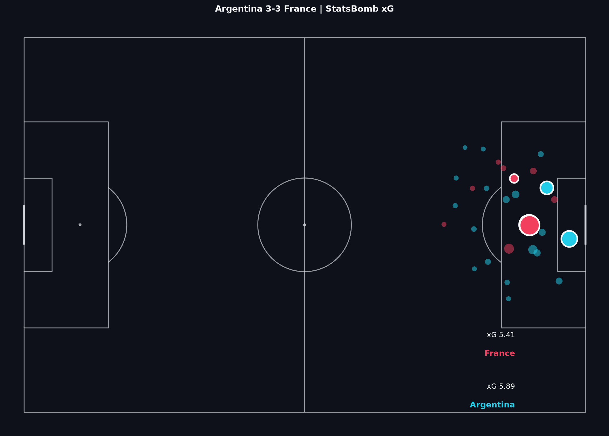
Argentina recorded more shots in regulation and extra time (~20 vs ~10) with the larger combined-xG sample (~2.76 vs ~2.27). France’s conversion from fewer attempts is part of the late-game story. Keep the shoot-out separate from this map’s match process.
How to read this
- Start with location and quality, then ask when the chance arrived. France’s late cluster is a phase story, not a first-half claim.
- Read volume with quality. More Argentine shots do not make the shoot-out inevitable.
- The penalty shoot-out is stored as a separate slice in this file. Do not fold those high-xG attempts into this process map.
Related Learn lessons
Visual 5
Pass network
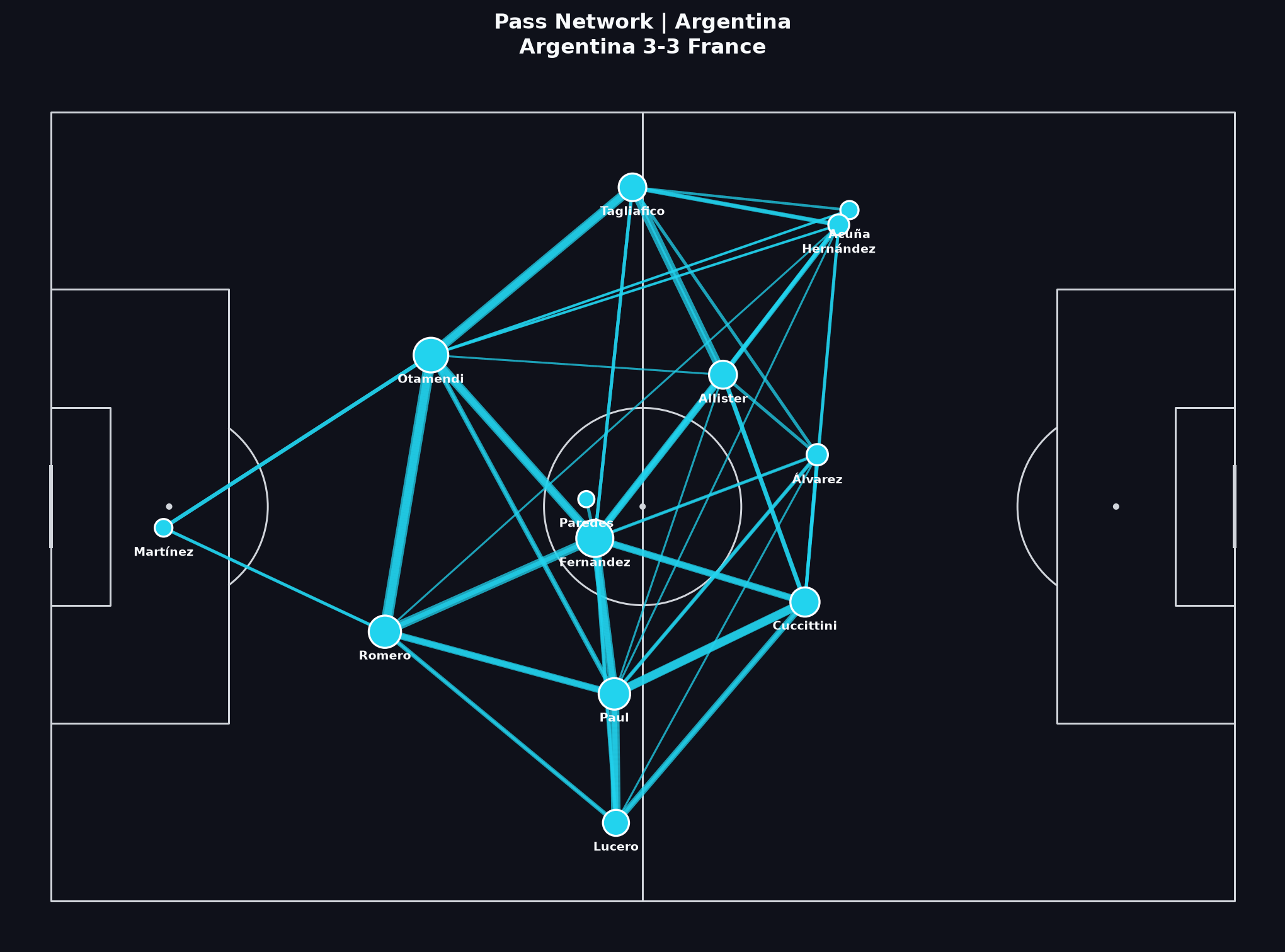
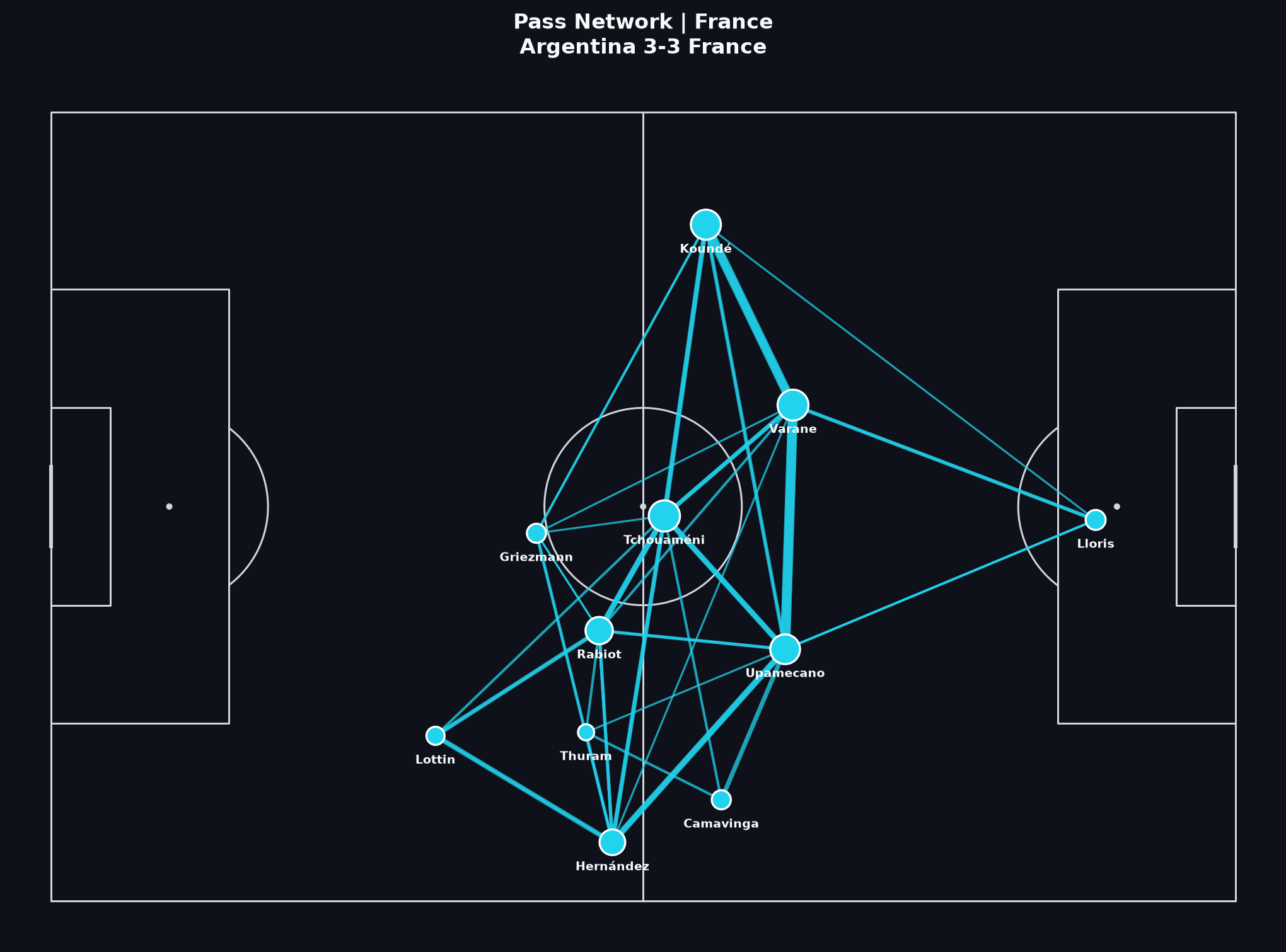
Argentina’s denser progressive structure sits beside France’s more selective connections. Density measures combination frequency. It does not overturn a late scoreline swing by itself.
How to read this
- Look for Argentine hubs between build-up and the final third. Frequent combinations can support territorial presence. They do not automatically produce box chances.
- France’s lighter graph can still show real circulation. A thinner network is not proof that they did not try to play.
- Game state matters. Extra time and a late chase average several phases into one graph.
Related Learn lessons
Visual 6
Progressive passes
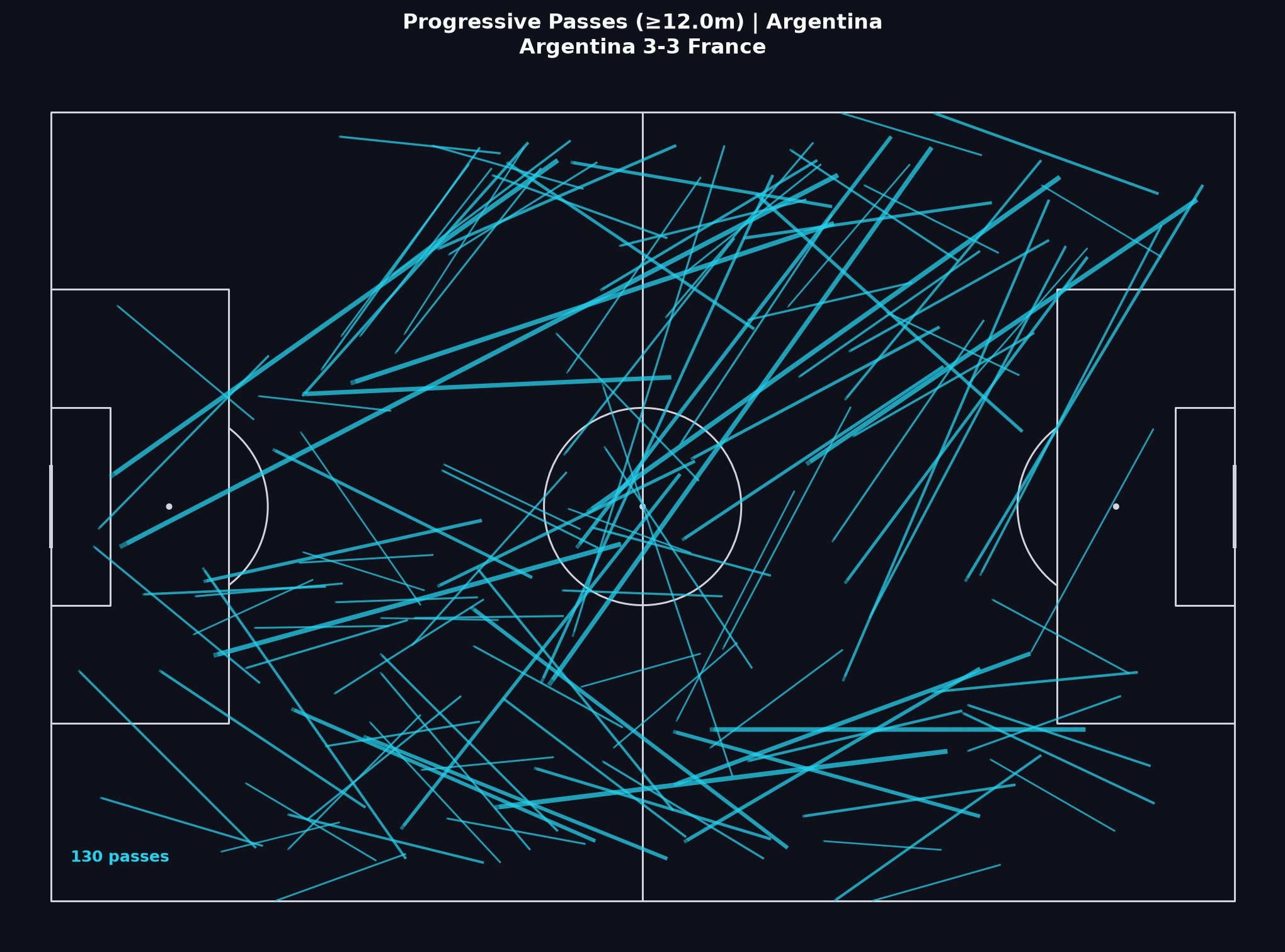
Argentina’s progressive share is much higher than France’s (~23% vs ~13%). Read that as a process difference. Then ask when France’s dangerous moments arrived.
How to read this
- High progressive volume suggests a team advanced the ball often. It does not guarantee high-quality shots.
- Trace start zones and end zones. Progression into the box means something different from sideways progress near halfway.
- Pair this map with the Shot Map. Progression without shots can be sterile control. Shots without progression can depend on transitions or set pieces.
Related Learn lessons
Visual 7
Average positions
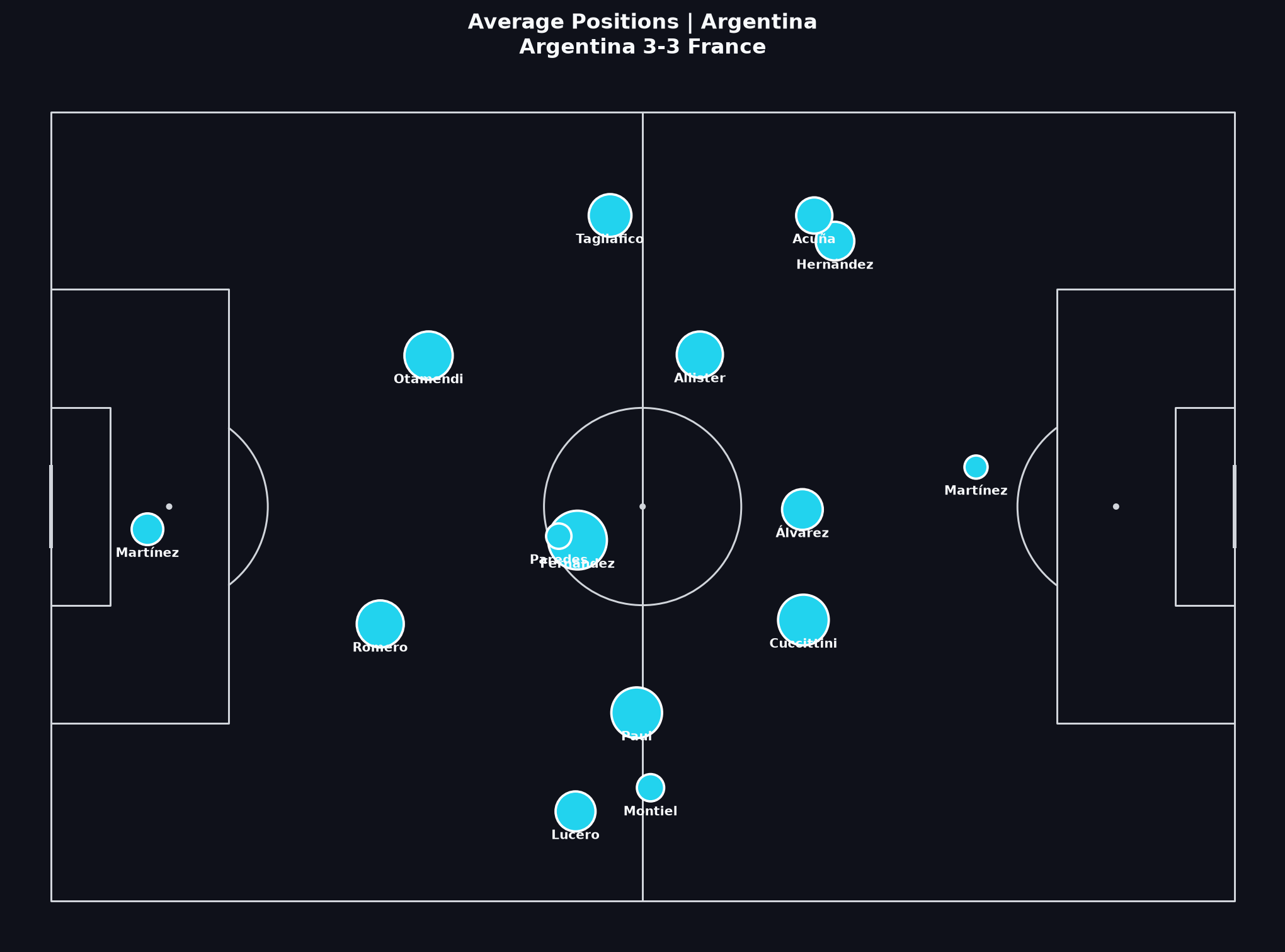
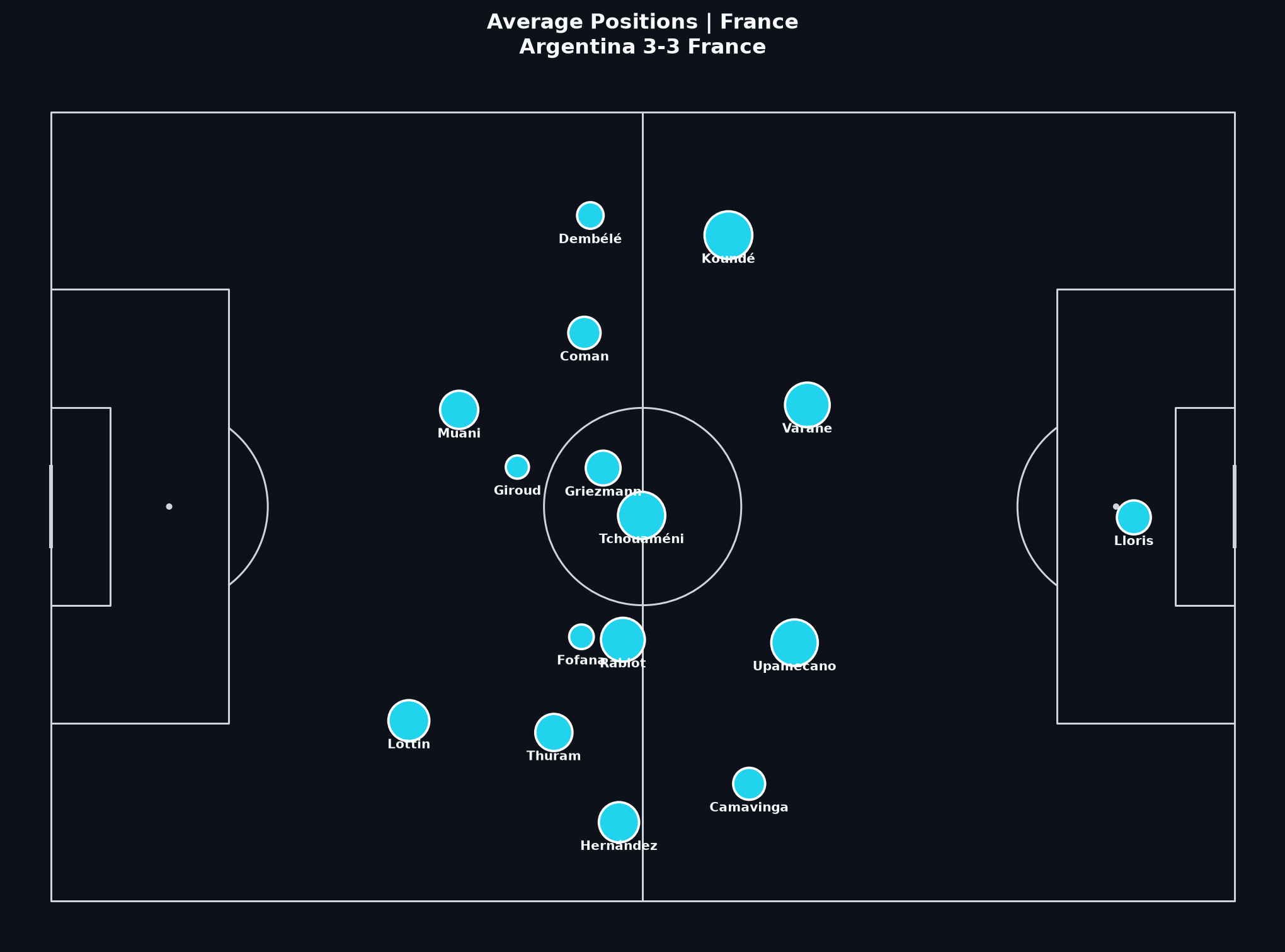
Markers show average on-ball action locations for players with enough actions. This is not a chalkboard formation. It is a spatial summary of involvement across a long final.
How to read this
- Average Positions are not tactical roles for every second. Extra time and substitutions pull the average.
- Use the plot to form questions about engagement height and central occupation. Then test them on video.
- A higher average block can show territorial control. It can also show a team chasing the game.
Related Learn lessons
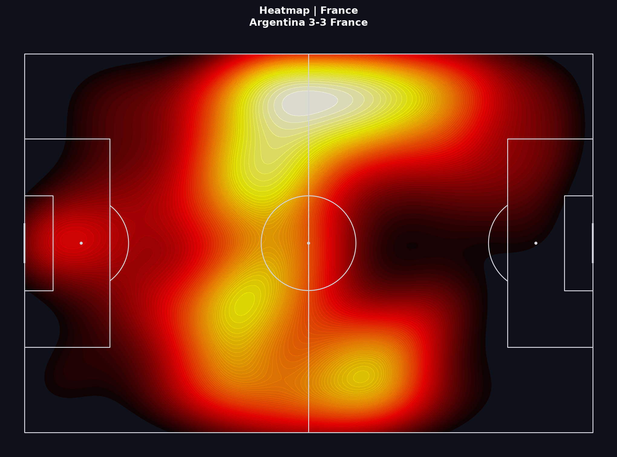
Putting it together
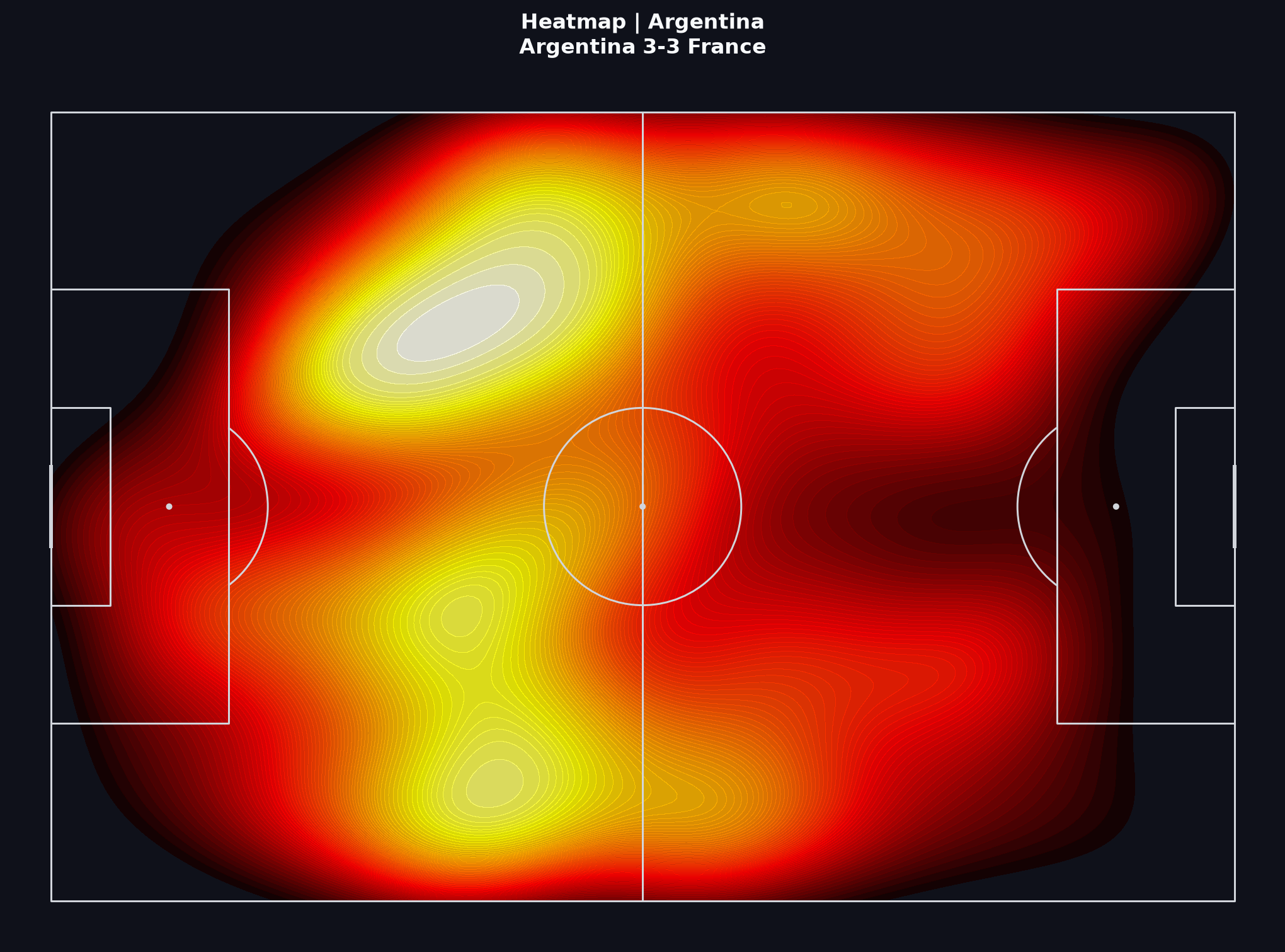
A responsible short report should separate Argentina’s larger combined-xG sample in regulation and extra time from France’s late cluster and from the shoot-out. Keep the shoot-out separate.
If you are following the Learn path, write five supported sentences from these visuals. Then note what still needs video.
Practice prompt
In 150–200 words: write one claim about Argentina’s shot process before the late equaliser, one claim about France’s timing, and one limitation of event data in this match. Keep the shoot-out separate. Link each claim to a visual above.
Concepts
Event data from StatsBomb’s public World Cup 2022 release. Coordinates use StatsBomb’s pitch model.